My Portfolio
Great that you are here! Take a look at my work in the UI/UX, graphic and web design fields.
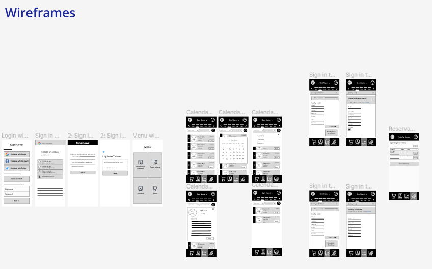
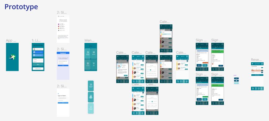
The Gym Booking App (an overview)
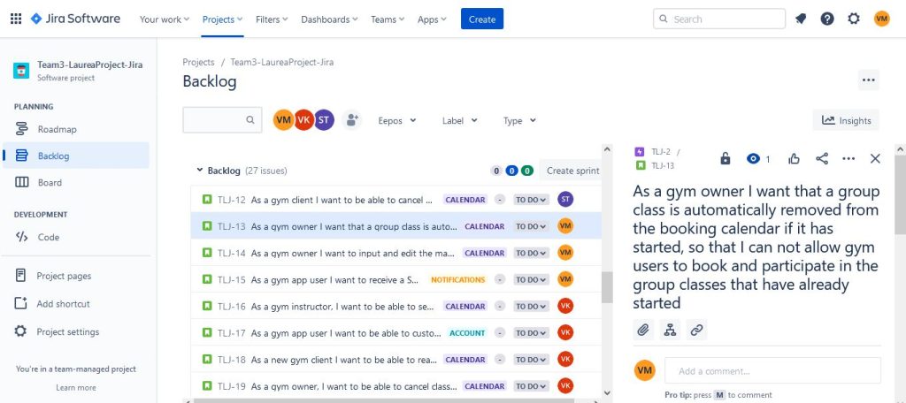
In 2023, during my study at Laurea University of Applied Sciences I took the “Defining and Designing a Software Product” course, where I created the Gym Booking App as a teamwork project. The goal was to implement a new app and learn how software is designed with Agile way of working. The software development method used was Scrum. Futheremore, the Gym Booking App was created as a user-centered software product.
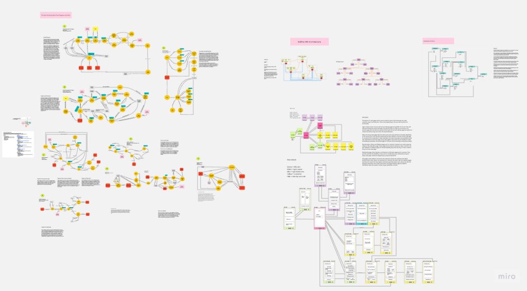
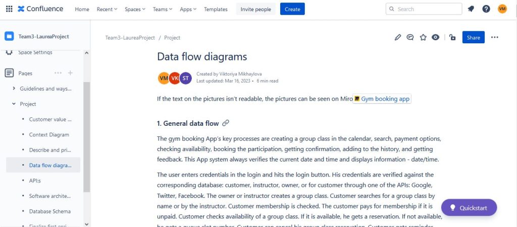
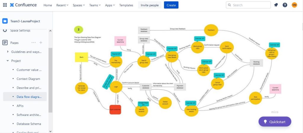
My motivation was to learn how to develop app from scratch by using reporting and prototyping tools: Miro, Jira and Confluence, and Figma. During this course I was focusing on learning how to make a plan for developing an app, software engineering. I draw a context diagram of planned software system, draw data flow diagrams (DFD) to present a flow of data through each process, defined and described an app’s APIs, defined SW architecture and defined schemas of an app’s database. Also, UI design usability evaluation was done by creating the Gym Booking App frameworks, mockup, interactive prototype using Gestalt Principles, Heuristic evaluation, and doing usability testing.
In the end of the Gym Booking App project I understood different methods used in creating software, learned how to perform and apply various software solutions myself and adopted a way of thinking with which a software project can be managed as a whole.
Check the Gym Booking App interactive prototype of my group work in Figma.
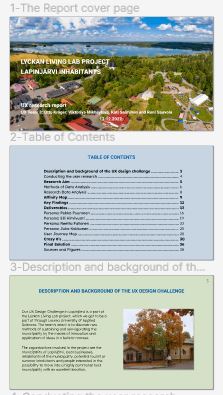
The Lyckan Living Lab Project (an overview)
During my study at Laurea University of Applied Sciences I took the “User-centred design of digital services” course, where I participated in the Lyckan Living Lab project for Lapinjärvi municipality. The goal of the Living Lab operating model is to create new business products and services to support the growth and development of companies, starting with the needs of enterprises.
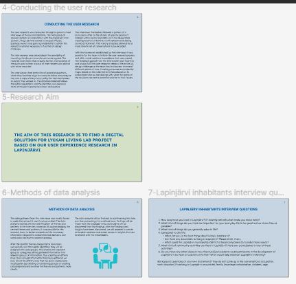
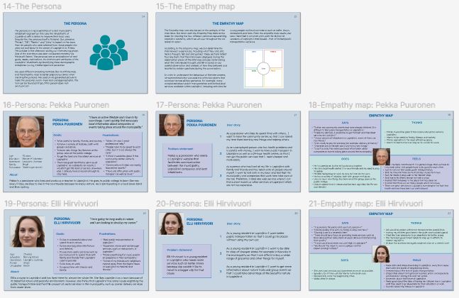
I participated in all stages of this project because I was eager to learn how a UX designer works in a real project. My motivation was to learn how to use different UX design techniques such as the use of a Persona, Empathy Map, Affinity Map, Journey Map and Crazy 8’s.
I, along with my team members, conducted in-person street interviews on 7th October 2022 and I later interviewed one resident remotely via Microsoft Teams. During the interviews I tried to learn, not only what the residents were saying, but also understand their emotions.
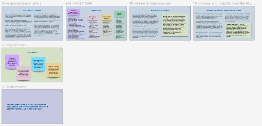
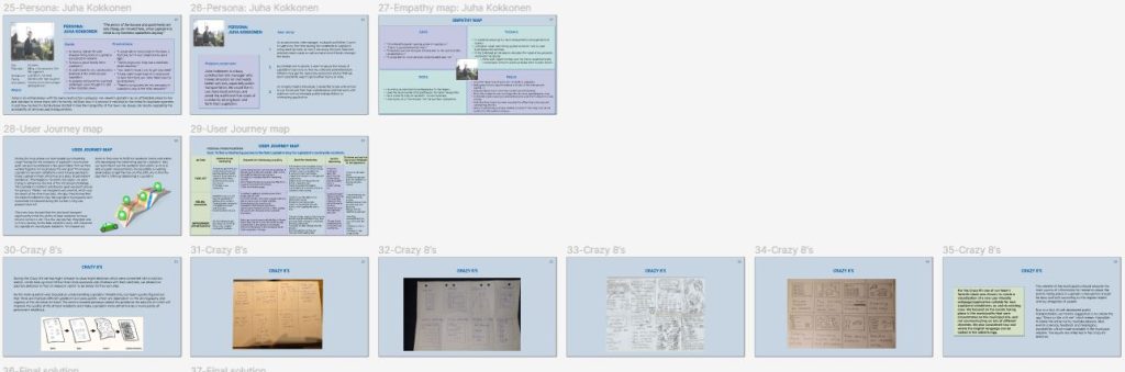
We used an Affinity map to gather key findings and insights from the interviews. In this project, limited public transport stood out as a key issue. As a solution we suggested a website or app-based hub platform which would include information on ridesharing services. We used a Journey Map to better understand the residents’ journeys and pain points such as difficult access to shops in and around Lapinjärvi. We used the Crazy 8’s method to design a webplatform for the municipality. In order to cater to tourists, we suggested that the webplatform be translated into English also.
At the end of this project our team crystallised a final solution, which is a website or app that centralises information about businesses, services, activities and events in Lapinjarvi, as well as an organised system for arranging ridesharing.
To check UX research report of my group work in Figma please visit https://www.figma.com
The SATO Project (an overview)
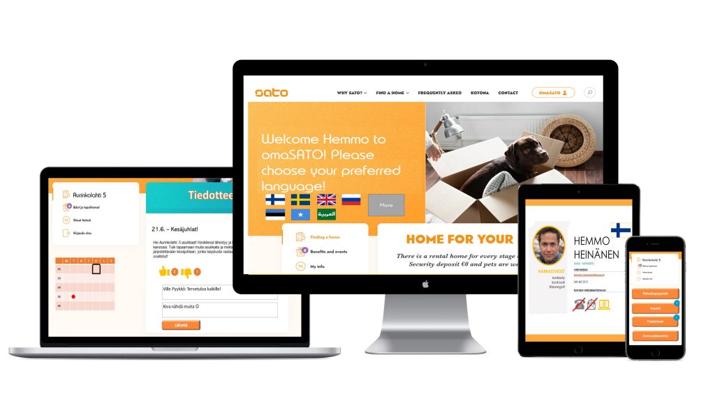
In Spring 2022 I completed the Service Design course which involved a UI/UX project for SATO Corporation, one of Finland’s largest rental housing providers.
This project’s objective was to improve the quality of SATO’s services. This involved analysing long-term tenants’ pain points and understanding why they weren’t using OmaSATO app as their main communication channel with SATO’s experts to, for example, request services or make complaints.
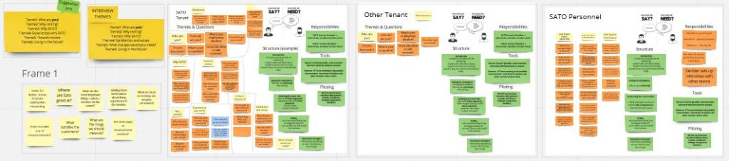
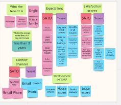
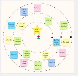
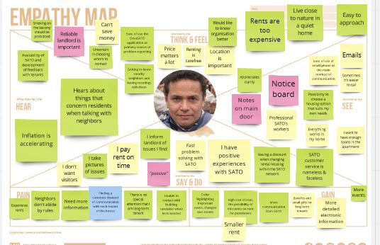
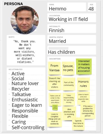
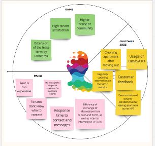
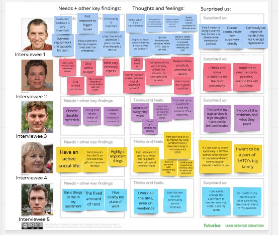
During the interviews with SATO’s tenants and SATO experts, the team gained a comprehensive understanding of living conditions in SATO’s apartments and how SATO provides the services for tenants. The empathy map and insights we created were based on the data we collected from the interviews and desk research. After an overview of the pre-sprint data, we created the persona based on answers during our interviewing phase. It was an embodiment of real needs, motivations, and attributes of the tenants with made-up demographics. We used the interview data and empathy map to make a customer profile where we group tenants’ comments on their responsibilities and their level of satisfaction with SATO’s services.
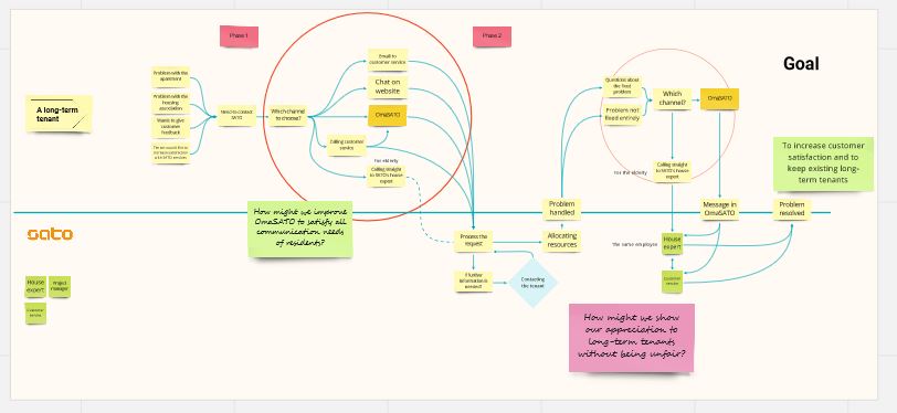
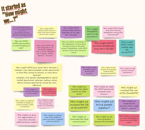
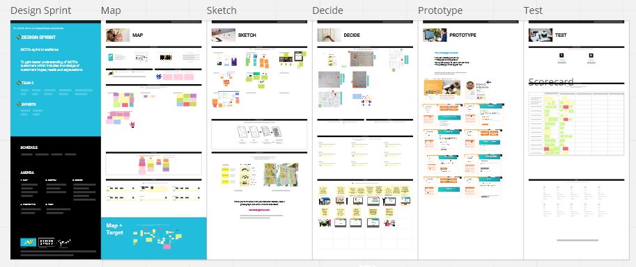
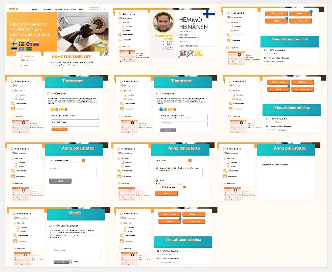
During five days Sprint our team went through the Map, Sketch, Decide, Prototype and Test phases. During the map phase the goal was to increase customer satisfaction and to retain existing long-term tenants. Our first step was to identify key improvements that needed to be made and how that could be achieved. The Sketch phase we started with “Lightning Demos“ and used a benchmarking method to better understand the practical implementation of SATO’s innovation needs. We began to write down some notes with the best ideas, targets, issues and positive thoughts, after which we drew some simple solutions to the issues using the Crazy 8’s method. During the Decide phase we presented to SATO personnel our best ideas for improving their services. The SATO experts chose the personalised profile for tenants in OmaSATO. During the Prototype phase, there was time to bring our solution to its preliminary version. We created a scenario for our Persona and described via mockup how our solution would work in that situation. After the prototype was ready to be presented and the questions were chosen, we agreed on our roles for the testing day. Before the Testing phase our team created a Five-Point-Interview where we tried to get information on the usability of the prototype and what needed to be added. We then presented the prototype to previously interviewed SATO tenant and SATO staff. The implementation of the calendar function would be convenient for both of them.
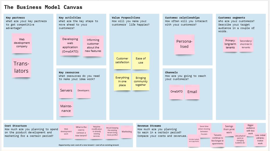
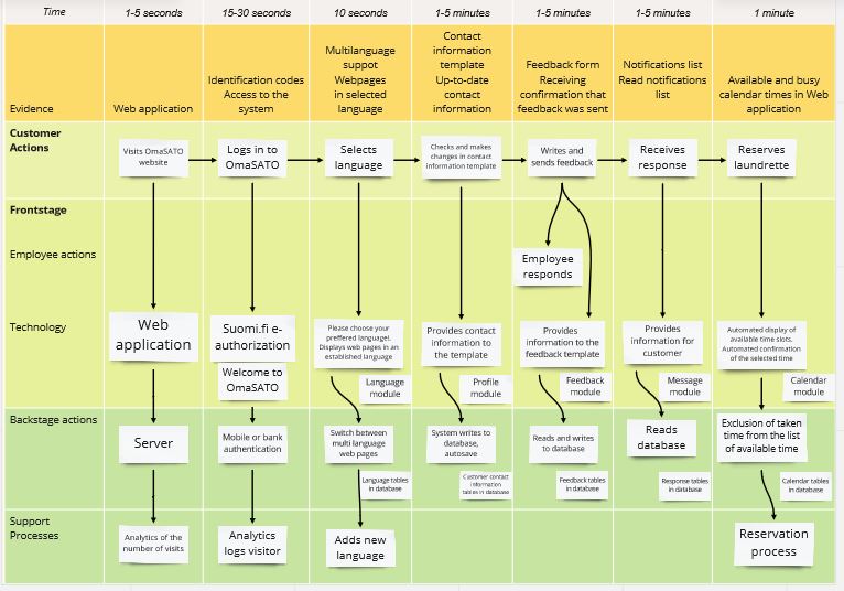
After building the prototype in the Sprint phase, it was important for our team to evaluate the financial side of the project using the Business Model Canvas strategic management and entrepreneurship tools and a common understanding of how everything works using the Service Blueprint tool. The Service Blueprint helps our team to understand the customer journey from start to finish, using the prototype OmaSATO application.
The result of our work was finding a new function for the OmaSATO application: a calendar. With the help of an electronic booking system, tenants can quickly and securely book common areas such as the laundrette or sauna. Furthermore, the calendar function is simple and clear without translation into different languages. For SATO, such a function will save resources in terms of material, time, and personnel, and does not require large economic investments. We believe that with our OmaSATO proposal long-term tenants’ satisfaction will increase, and SATO will retain its existing customers.
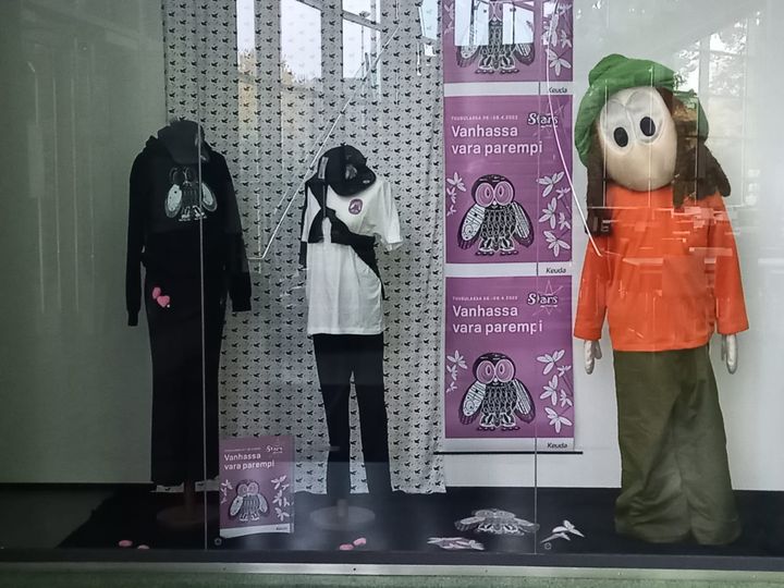
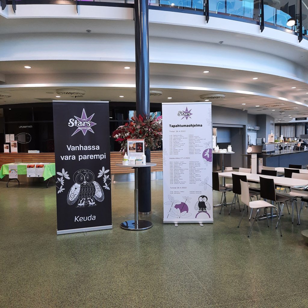
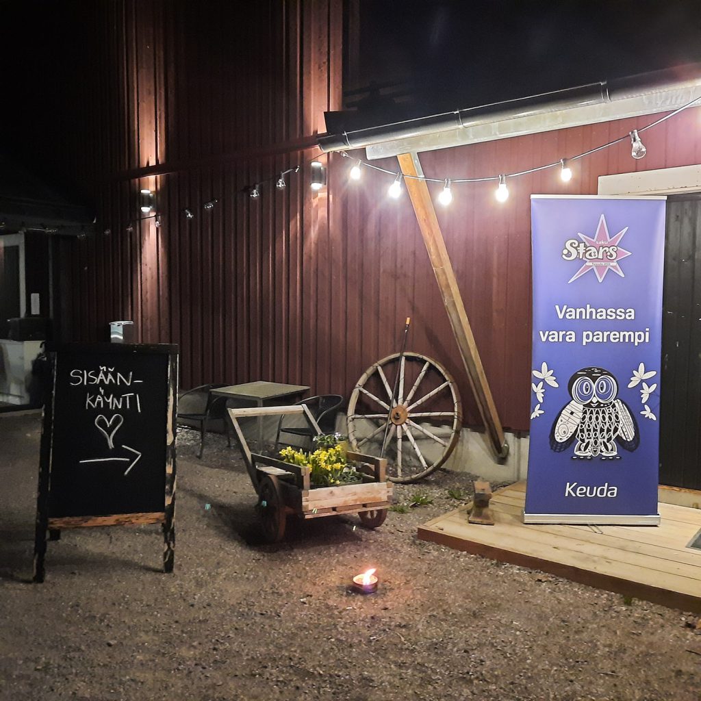
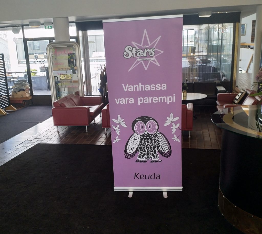
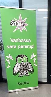
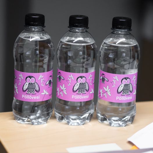
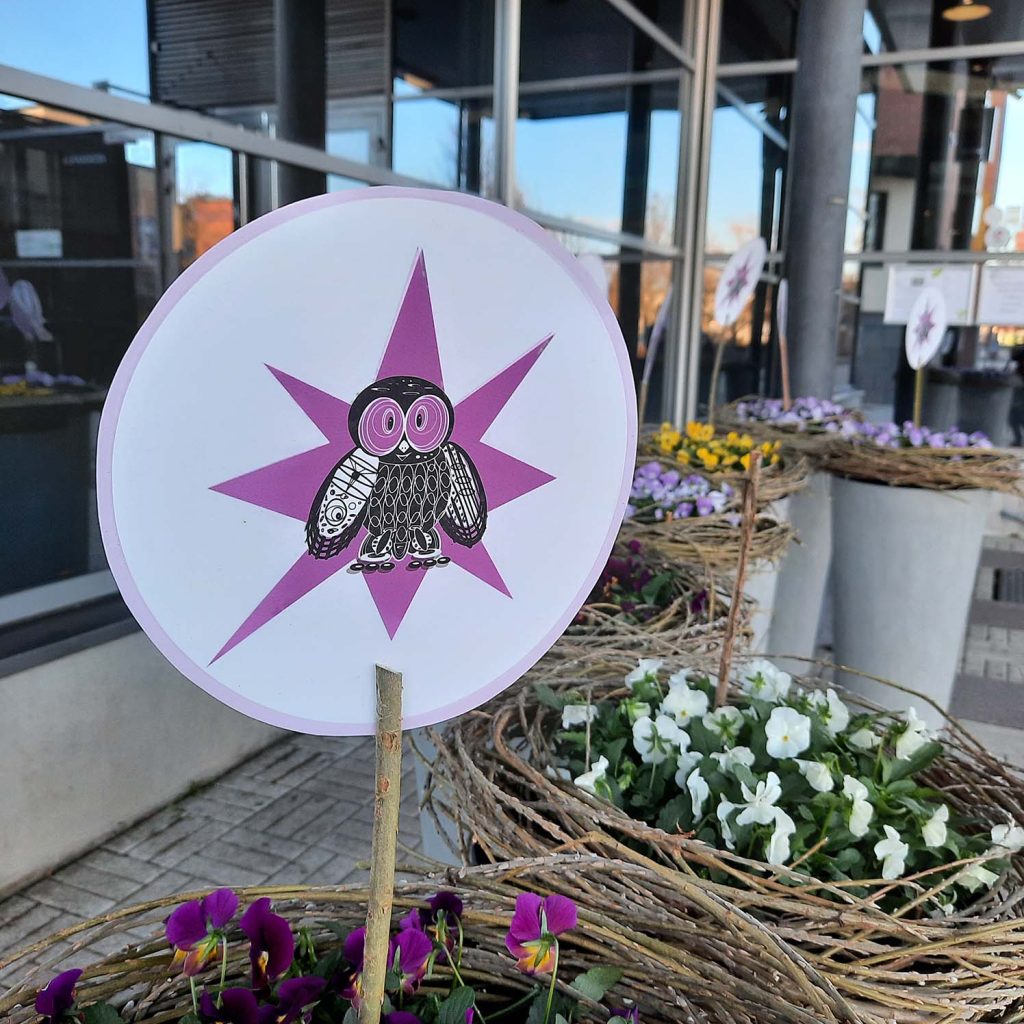
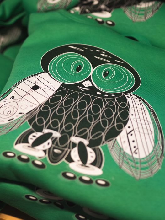
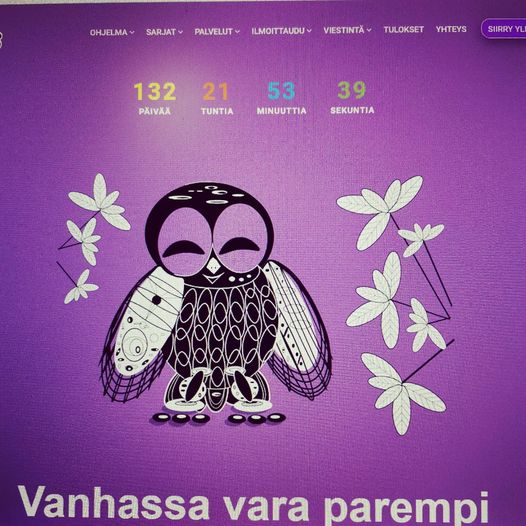
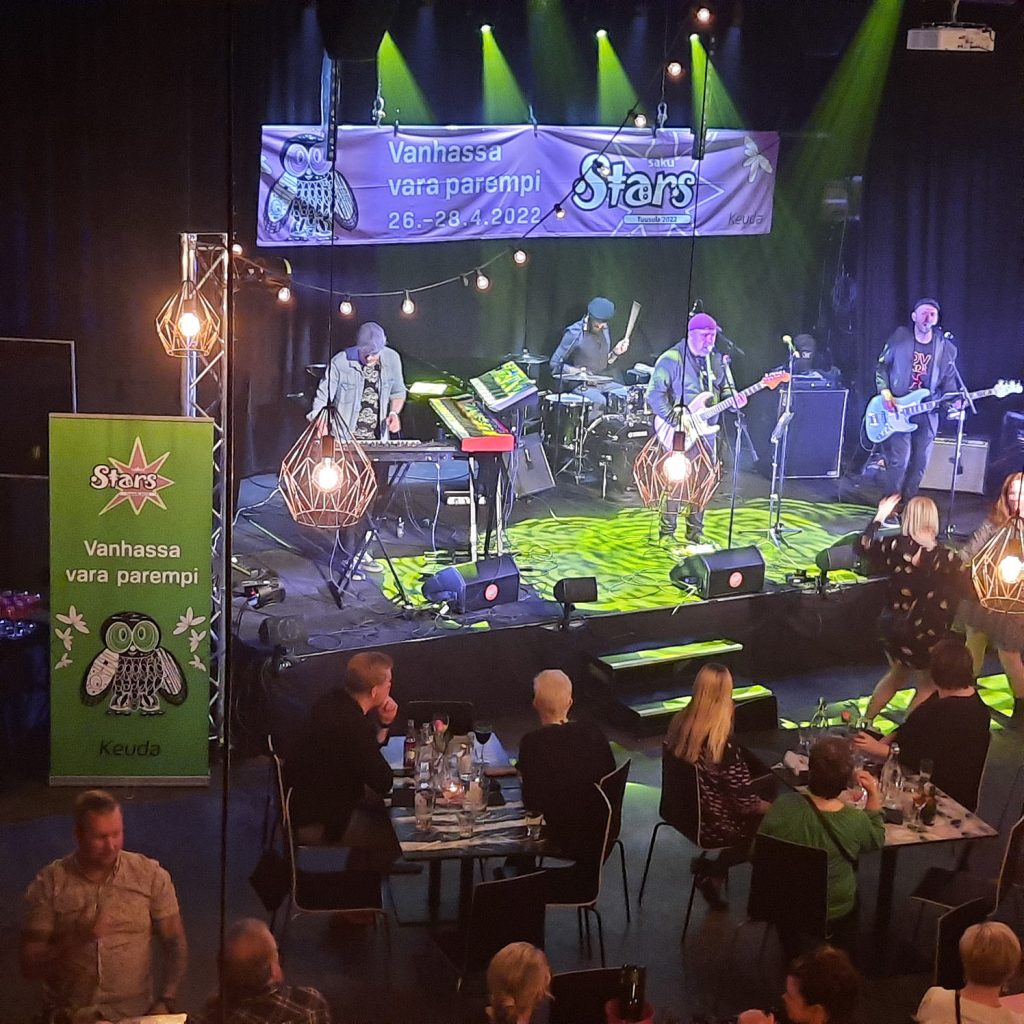
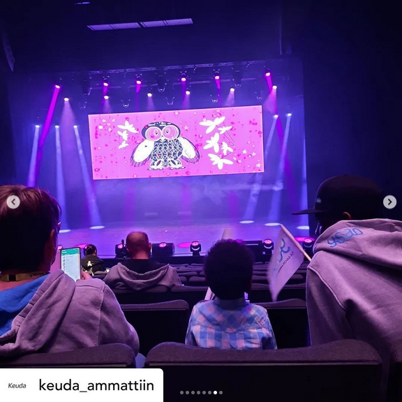
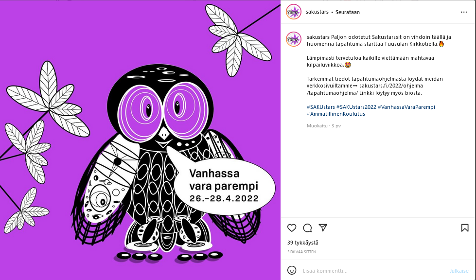
The SAKUstars 2022 project (an overview)

The Graniitti project (an overview)
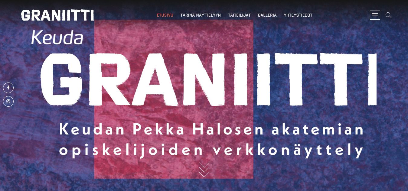
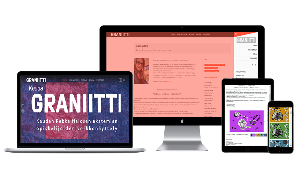
In 2020, I created a WordPress website for the Pekka Halonen Academy students’ web-exhibition “Graniitti”. I had several meetings with the web-exhibition organisers to fully understand their needs. As a result, a WordPress gallery theme was chosen for the web-exhibition with a brief bio for each artist. I modified this theme by using HTML, CSS, PHP and JavaScript coding languages. I changed the layout of the pages and the images, which included adjusting font sizes and the logo size and positioning. This theme is still being used on the website https://phaopiskelijat.keuda.fi/.